It’s always fascinating to analyze the decision-making process throughout the development of a new brand strategy.
In 2021, Kia’s new branding caught the eye, quite literally, with a launch event that saw hundreds of unmanned drones lighting up the Seoul skyline with a flashy fireworks display.
The drones served to form the new logo design, lit up proudly in the night sky.
The whole event was slick, futuristic, and innovative.
A deliberate choice, given the brand’s new approach.
Let’s examine the story of Kia’s rebrand a little more closely.
A Brief History Of Kia

Kia Motors company is a car manufacturer.
They’re the second-largest car company in South Korea behind long-term competitor Hyundai.
However, Hyundai is the parent company and umbrella brand of Kia after they acquired the brand in 1998.
Founded in 1944, the company started from humble beginnings.
They made bicycle parts and steel tubing before transitioning to the automotive industry in 1952.
Over the decades, Kia has had fluctuating success, obtaining licenses as an automaker for Mazda and Honda until stopping operations in 1981.
They then reentered the market through a partnership with Ford.
After languishing as a bit-part player in the past, Kia Motors has been widely successful in the past decade.
The automaker leapfrogged Ford and Volkswagen to the number one spot for cars sold in the UK in the first quarter of 2022, while its market share in the US is steadily increasing.
The Rebrand Narrative

Brand strategists try to communicate a consistent narrative to their audience through their messaging and experience.
When done well, this evokes desired feelings in the audience’s mind.
Think of the branding of two major car brands: BMW and Tesla.
One of these plays on ideas of reliability, German engineering, luxury, and automotive heritage.
The other frames itself as a sustainability and luxury pioneer, unapologetically accelerating the world’s transition into sustainable energy.
This mentality is closely aligned, purposefully, to the personality of its controversial billionaire CEO Elon Musk.
Luxury German Automotive Heritage vs Luxury Sustainable Energy Pioneer.
These are two distinctly different narratives.
Yet, they both work since they resonate with different parts of the car-buying market.
The purpose of Kia’s rebrand, then, is to tell a new story to its target market.
They’re betting this will differentiate them from their competitors and carve out a larger market share.
PRO Brand Strategy BluePrint
Build Brands Like A Pro Brand Strategist

A Brand For The Future
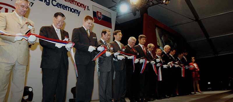
In January 2021, the carmaker launched a rebrand with a Guinness-world-record-breaking light show.
Kia is the latest car company to rebrand as the crowded field of car manufacturers is increasingly saturated.
Each player is trying to find a competitive edge in a rapidly changing industry.
From Kia’s perspective, they are rebranding with a new brand image as they look to move into the innovative electric vehicles product category.
Alongside the new product direction, Korean carmakers have introduced redesigns of old models and hinted at a forward-thinking range of new models, taking electric cars on the next step toward widespread use.
They have revamped their brand assets, including a radical shift in the Kia logo, a new slogan, and an updated approach to the graphic design featured on their website.
Why?
It’s all about telling a new story to their audience.
With this update, Kia is attempting to frame itself as a futuristic innovator, shown through sleek design and messaging that hopefully inspires the audience.
Kia is aiming for an upgrade to a ‘cool’ new brand perception. It aims to be seen as a frontrunner in the green revolution in the automotive industry.
This is a move to solidify their presence in the car industry moving forward.
Let’s explore some of those new brand elements.
Explore Brand Strategy
Programs & Tools
Kia Logo: Evolution
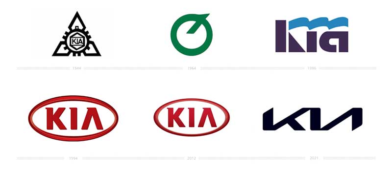
A lot of thinking goes into logo design.
An effective logo will incorporate many brand elements and act as a reflection of the brand’s image.
This brand identity will run like a seam through all visual communication.
That’s why, when a company radically redesigns its logo, you can analyze the changes to evaluate exactly what the designers are trying to say.
Over the years since its inception, Kia has had six different logos.
We’ll focus on the iterations since 1994 and compare those with the latest revamp.
Kia Brand Identity: 1994-2012
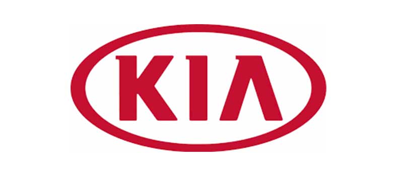
1994 saw the adoption of the red and white color palette that we associate with Kia Motors.
Red and white are both eye-catching, attention-seeking colors. Kia chose them for these qualities, but they serve the secondary purpose of linking to the brand’s Korean heritage.
The logo features a wordmark – the letters KIA – in a simple, easy-to-read, bold typeface.
The wordmark is then encased in a red oval, symbolizing the company’s global status.
This logo was a significant step away from previous logos that featured more design elements.
This logo was notable for its stripped-back, clean and crisp look.
Kia Brand Identity: 2012-2020
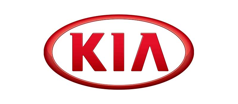
In 2012, Kia decided to update their logo by making it brighter.
This partial refresh saw no change to the design elements as the oval and wordmark remained.
The red, as mentioned, was brightened, while the lines became cleaner and bolder.
This is clearly an enhanced version of the first with a pleasing minimalist design.
So, what do these two logos say about the brand identity of Kia during this period?
Well, as is often the case, comparison bears the sweetest fruit!
Let’s look specifically at what changes with Kia’s new logo to see if we can note the narrative shift.
The New Logo
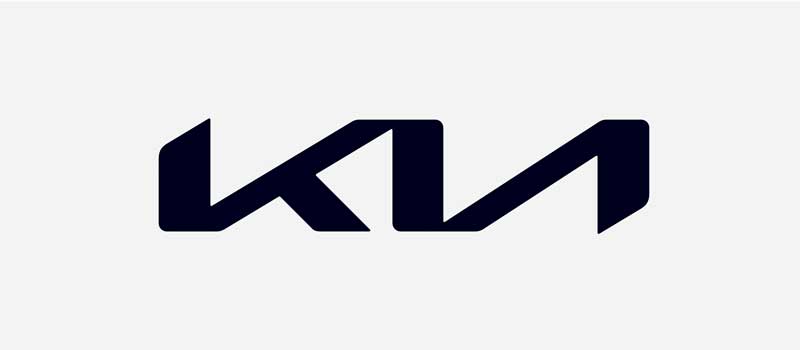
The redesign replaces the red and white with a monochromatic black and white design.
The simple, easy-to-read typeface makes way for a handwritten-signature-esque script of the three letters.
At first glance, it’s quite tricky to pick out the abstract ‘K-I-A’.
This stylized inscription looks energetic and youthful as the letters flow into one another, giving the impression of sophisticated movement.
While the typeface flows, it does so in an angular fashion.
A notable characteristic is the two angular rising slants forming parts of the ‘K’ and ‘A’ that provide some symmetry to the wordmark.
This is intentional and packed with meaning.
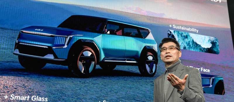
Says Ho Sung Song, Kia’s president, the “rising gestures embody Kia’s rising ambitions for the brand,” while the symmetry “demonstrates confidence.”
Of course, the average joe doesn’t look at a logo and make deep analytical insights on what each feature connotes on a deeper level.
They do, however, subconsciously take in the shift in direction.
The brand immediately becomes more stylish with this colour choice by replacing the red with a black and white design.
Luxury fashion brands have long understood the power of black as an indicator of sophistication.
Chanel, Dolce & Gabanna, and Gucci, are perfect examples.
The angular slants of the wordmark certainly take on a futurist feel.
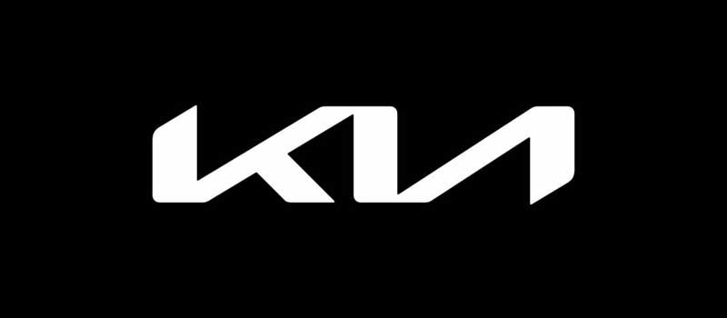
Compare the design with the simplistic nature of the previous typeface, and it’s clear that this update notes a step toward modernity.
The design resembles other classic, black-and-white logos of tech-adjacent companies, such as Sony’s logo for the PS5, Chinese phone company Vivo’s simple black-and-white design, or even Apple’s half-bitten logo.
This alignment with tech companies is no accident.
Kia indicates its shift from basic, utilitarian, uncomplicated cars to forward-thinking, futuristic models.
Yet, it wants these futuristic models to become the norm instead of a niche product.
This is further supported by its new slogan.
The New Slogan: “Movement That Inspires”

Any brand strategist worth their salt will appreciate a slogan that works on numerous levels.
First of all, the phrase ‘movement that inspires’ could actually work as a description for the logo itself.
The word ‘movement’ is not only a clear reference to the movement of a car, but also to the idea that the whole industry is undergoing a transformation as it looks to shift to a greener future.
Kia itself is mirroring this transformation by refreshing all facets of its business.
Effectively, it’s a new brand to match a new electric-car-focused era.
The rebrand “represents the company’s commitment to becoming an icon for change and innovation [reflecting] our desire to inspire customers as their mobility needs evolve.” according to CEO Ho Sung Song.
It’s rather grandiose, but their branding elevates them from the business of selling cars.
Instead, it frames them as the vanguard of a green revolution for the industry, serving the people’s needs as an ‘icon’ for innovation.
Kia Repositioning For The Future
Only time will tell whether Kia’s rebrand will convert into sales and work to cement its place in the automotive industry.
It’s an excellent lesson in strategic branding that highlights the need for brands to evolve to match the needs of their audience or risk becoming irrelevant.
Brands don’t exist in a vacuum, and any branding strategy needs to consider the competition.
Brands must strategically position themselves by considering the needs of their audience and how those needs are being met by competitors.
This position relies on significant market research, something the marketing guys at Kia have evidently done.
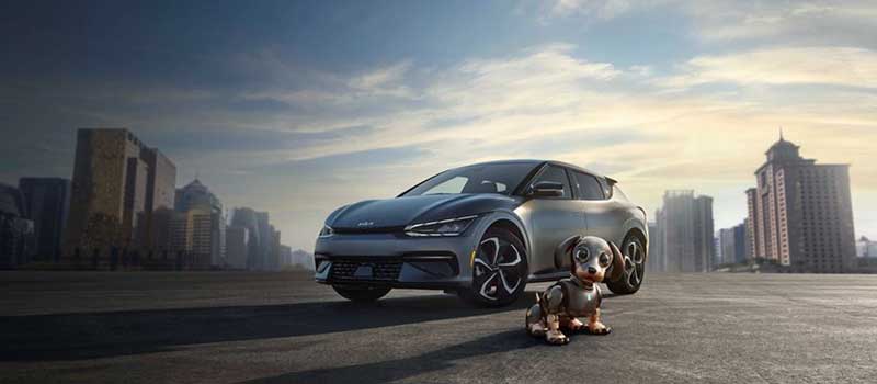
They have found what they believe to be a market gap and have developed a strategy that aims to bring electric vehicles to the masses.
Electric cars are the future of mobility, so Kia has designed a brand to match this future in the hopes of stealing a march on the competition.
While Tesla may be the early headline makers in the area of electric vehicles, they play in a luxury market that doesn’t cater to all segments.
Kia aims to differentiate itself with sleek, modern designs while retaining its affordability.
That distinction of the future, but for the everyday person, may turn out to be a winning strategy.
Over To You
Fuel any rebranding efforts with sufficient market research.
All brand assets, including logos and slogans, should reinforce consistent messaging.
Branding should evolve over time to match industry trends, considering competitor activity.
While analysis of design elements can often seem high-concept, the intended audience is receptive to shifts in brand direction.
Successful branding is telling the same story through each brand element.
On-Demand Digital Program
Brand Master Secrets
Make the transition from hired-gun to highly valued brand strategist in less than 30 days. The systems, frameworks and tools inside this comprehensive program are all you need to level up.



Very insightful and inspiring case study. The way you analyse it, is stellar. I learned a lot on how a brand can strategically differentiate from mainstream (car industry) competitors and niche (Tesla) players, by understanding clearly consumers deepest desires. Thank you for sharing this (successful) best practice.
Much Appreciated