Triangle-shape tortilla chips that leave dust on your fingers.
We’re betting that this sentence would immediately bring one brand to mind for 99% of the population.
Now that’s brand recognition.
Okay, we’re cheating a little since you’ve already seen the title.
Of course, we’re looking at the ‘little golden things,’ the iconic Doritos brand.
This article will examine exactly what makes the Doritos brand work with a deep dive into its logo.
We’ll also see evidence of Dorito’s connection with its target audience by looking at what happened when a rebranding concept went viral.
Doritos History
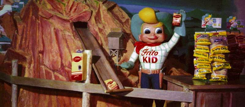
The history of Doritos is, fittingly, the stuff of legend.
The story goes that, back in 1964, a restaurant in California-based Disneyland fried up its leftover stale tortillas with a selection of spices.
And so, like any modern Disney Marvel character, the hero was born with a legendary origin story.
Thus, the iconic tortilla chip brand came into existence.
From these perhaps accidental origins, the brand has evolved through time to become one of the best-known, immediately recognizable snack brands worldwide.
The brand in its current form is a social-media-savvy behemoth, with sophisticated ad campaigns that stay trending, supporting the notion that Doritos signifies an extreme, vibrant lifestyle with its tagline “for the bold.”
But it’s just a bag of Doritos, right?
How did the Marketing guys and gals at Pepsico equate the Doritos brand name with a vibrant, carefree lifestyle?
Well, let’s look at the Doritos logo evolution as one aspect of its branding.
Doritos Logo Evolution
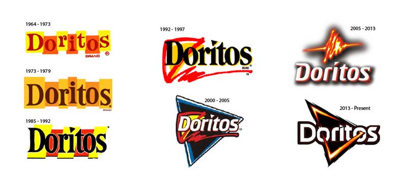
You can almost see the brand managers’ thought processes over the last six decades as you look at the evolution of the Doritos logo.
There have been several iterations as the brand consistently listens to its target audience to shift and stay relevant.
PRO Brand Strategy BluePrint
Build Brands Like A Pro Brand Strategist

1964-1992:
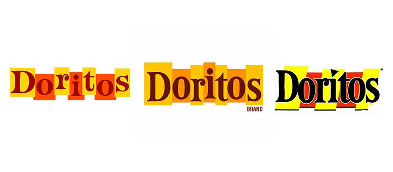
Doritos’ first three logos featured a wordmark encased in seven vertical rectangles.
Initially, the vertical rectangles featured saturated alternate red and yellow coloring.
The red represented peppers, while the yellow represented corn.
The second logo featured more monochromatic colors before a return to red and yellow for the third.
The typeface used gets increasingly bold and chunky as the years progress.
The 90s:
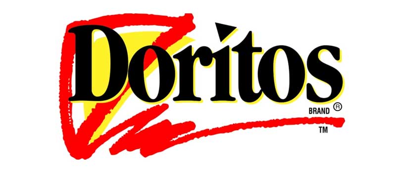
The 1990s saw the removal of the rectangles in favor of the triangle.
The bold black wordmark receives a yellow outline, while the dot above the “i” is replaced with a triangle. A yellow triangle outlined with red forms a freeform border around the “D” in Doritos.
The 2000s:
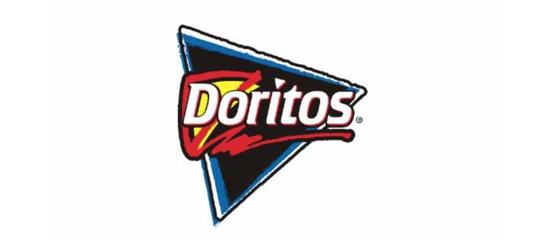
This update takes the core elements of the 1990s logo but places it on a bold black triangle background outlined with blue, enhancing the red and yellow triangle behind the now white wordmark.
The 2005-2013:
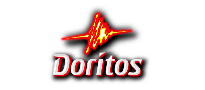
3D logos were all the rage in North America for a time, as evidenced in this logo that features a shadow around the white Doritos wordmark.
2005 saw a shift in the logo as the black triangle disappeared.
The red and yellow triangle above the brand name is now heavily stylized, resembling fire or a high voltage sign, tapping into the fiery, powerful taste of the chips.
The 2013-Present:
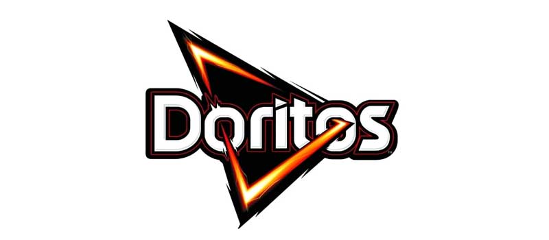
The current iteration of the logo. For the 2013 rebrand’s new logo, the Doritos marketing team traveled to different markets to study its target audience worldwide.
As a result, they opted for a dynamic, bold design intended to inspire.
They reverted to the black triangle bordered with a fiery gradient of yellow, red, and orange. The triangle pierces the ‘O’s in the Doritos wordmark.
Explore Brand Strategy
Programs & Tools
Case Study: The ‘Anti-ad’ Ad Campaign
Doritos has built a reputation for edgy advertising, part of their brand identity to stay ahead of the curve and appeal as an exciting brand.
Over time, you can see this through their humorous high-concept Superbowl ads that follow trending themes.
In 2019, they launched a campaign to appeal to their Gen Z audience, notoriously skeptical of traditional advertising methods.
They named the campaign “Another Level.” The phrase could have multiple meanings, connoting gaming, highlighting the belief their product is on another level from its competitors or signposting the notion that we’re shifting into a new era of branding.
Whatever meaning you choose to interpret, it’s undeniably enigmatic, indicating a transformation of some kind.
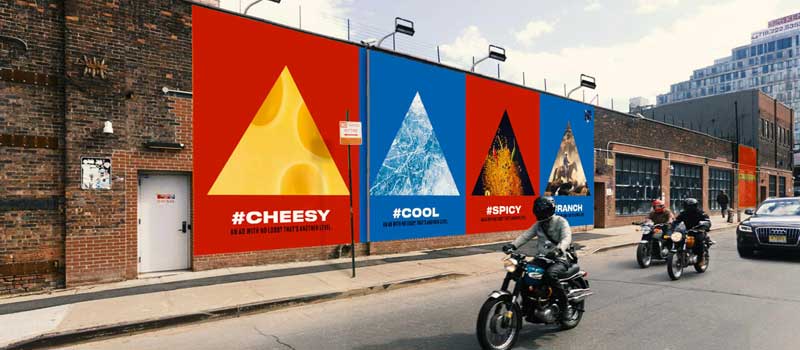
As part of the ‘Another Level’ campaign, Doritos decided to cleverly play on its own brand recognition, creating a campaign that did not feature its brand name or logo but using all of it’s other associations in a game of “Guess The Brand”.
Talk about flexing!
Instead, the campaign plays on the idea of the triangle, using images of triangular things while playing on other associations of the product, such as the infamous ‘Dorito dust.’
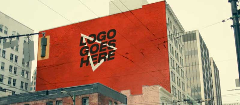
They doubled down on the idea by replacing the Doritos logo with a simple triangle accompanied by the caption ‘Logo goes here’’.
The whole campaign was supported by other promotional activities designed to attract younger consumers, such as a Snapchat filter that transformed your face into a triangle.
The narration over the adverts means that, by the end of the advert, it’s unmistakable that this is a Doritos campaign.
Yet, it’s still impressive to think that the brand has built such a reputation through these immediately identifiable associations that it can run such an ‘anti-ad’ campaign without sharing its logo or brand name.
It’s a perfect illustration that a brand is not a logo, but a collection of associations that creates perceptions built up through experiences
It’s a testament to the feelings the brand evokes in its audience that you can evoke with this vibe without a recognizable caption, logo, or brand name.
Let’s look at a second case study to further explore this connection between the brand and its audience.
Case Study: Michael Irwin’s Redesign Concept (Fake Rebrand)
Michale Irwin is a conceptual designer.
His Instagram page showcases some of his conceptual designs. He shares them as examples of different creative ideas and design examples to explore different brand directions.
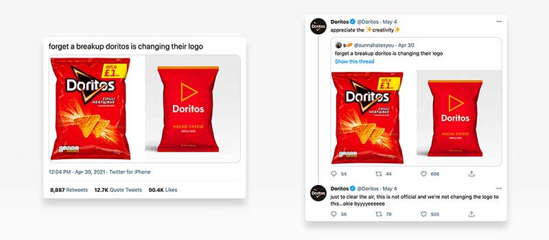
Recently, his rebrand design concept for Doritos went viral among fans and non-fans alike.
His creative impulse was simple enough.
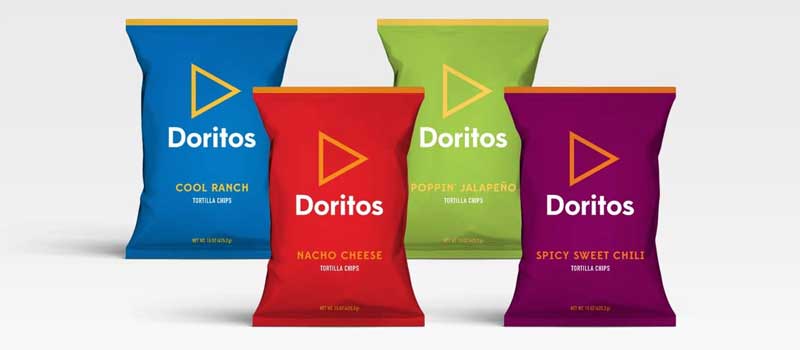
He wanted to create a concept of an “uber clean” Doritos rebrand.
He wanted to strip away all the extreme elements of Doritos’ branding, taking away the fire, the energy, and the bold aggressive marketing campaigns to create minimalist package designs.
He used a simplistic typeface, a solid muted color to differentiate between flavors, and removed any other eye-catching graphics from the packaging.
He wanted to infer that the simplistic packaging was like a red flag, hiding the explosion of flavor contained within.
Doritos ReBrand Riles Fans

The result is plainly a clear contrast and would constitute a clear break from the current Doritos’ brand direction, as picked up on by Doritos fans.
Despite the fact Mark clearly identified the design as a ‘concept,’ the post went viral and was picked up by several websites claiming a Doritos rebrand.
The reaction was unanimous; people did not like the rebrand.
There was even a petition on Change.org with thousands of signatures to get Doritos to their usual concept.
This reaction holds a lesson in branding.
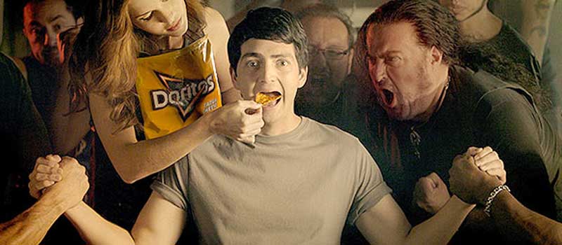
When done well, branding generates an emotional connection between audience and product.
As a result, there can be intensely negative reactions when a brand is seen to break that connection by doing something drastically different or new.
To the consumer, the new minimalist packaging broke the brand promise, even though it wasn’t real!
For the Doritos marketing team, who watched on with interest, this was an exercise in how not to do a rebrand.
It shows how effectively they have listened to their audience in the past, and, due to their loyal customer base and brand recognition, why they will need to continue to listen to their audience when considering future alterations to their brand.
On-Demand Digital Program
Brand Master Secrets
Make the transition from hired-gun to highly valued brand strategist in less than 30 days. The systems, frameworks and tools inside this comprehensive program are all you need to level up.


