We begin to develop an emotional connection to colors from our early childhood. This goes far beyond a simple expression of likes and dislikes – different colors affect us differently.
The right color can make us feel calm, happy and vibrant – the wrong color can evoke feelings of fear, danger, or oppression.
This notion of the psychology of colors makes choosing your brand colors all the more important. It is essential to consider color meanings before committing to your brand’s color scheme.
Want to understand the impact of color psychology in branding?
In this guide, we’ll take a closer look at color associations and their relation to your brand identity, with reference to some examples along the way.
Brand Color Psychology: An Overview

Human behavior is often dictated by how we’re feeling at any given moment.
Therefore, purchasing decisions are often emotional choices.
What we choose to buy – and who we buy it from – often depends on how we emotionally perceive a brand.
So, it follows that if colors affect our emotions, then
choosing the right color combination for your brand is one more marketing tool you can use to attract your ideal customer.
You may have color preferences and feel inclined to use your favorites in a brand, but color connotations vary depending on context and have different meanings to different demographics and individuals, and you have to keep its psychological effects in mind before committing to specific colors for your project.
Thankfully, color theory borne from numerous color psychology studies means we can outline some general understandings.
Note:
That there are different shades, tints, and tones within each color, with their place on the color wheel (more on that later). That means that there is scope for a whole range of associated emotions within the category’ red’.
Let’s take a look at each color to give you a better idea.
Red
Red is a warm color commonly used for stop signs, sales tags, negative finances, and call-to-action buttons. It’s one of the most striking, stirring colors.
Use it with care as it can trigger powerful emotions — both positive and negative.
Red Attributes & Personality
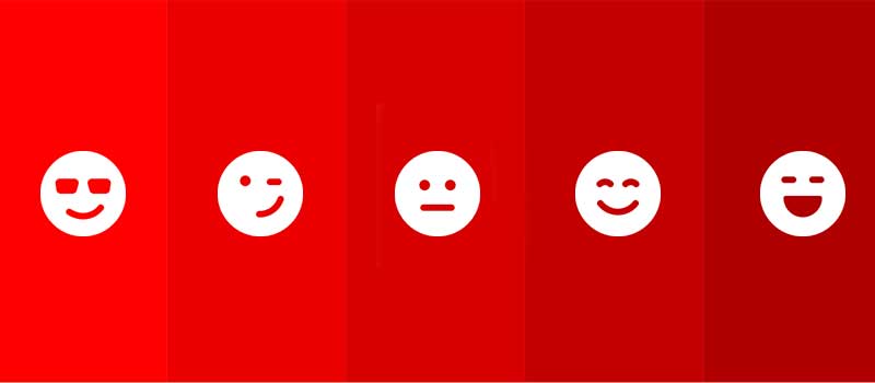
The positive attributes associated with red include:
Power
Passion
Energy
Fearlessness
Excitement
The negative attributes associated with red include:
Anger
Danger
Warning
Defiance
Aggression
Pain
When To Use Red In Branding (or Not)
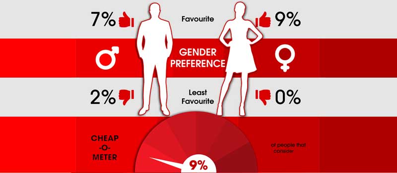
One of the most famous brands in the world, Coca-Cola uses the color red to stir power, passion, and energy.
Red creates a sense of urgency, making it an effective color for sales while it also encourages appetite, which wasn’t lost on McDonald’s.
Red also evokes a feeling of excitement which is why fast cars and lingerie are popular in red.
On the flip side, its negative connations are danger, fear, and anger.
Studies show that the color red reduces analytical thinking. And cultural differences also play a role in the use of this color.
For example, in China, red represents luck, joy and happiness. But in the US, it represents hardiness and valor.
Brands That Use The Color Red
Household name brands using the color red include
Coca-Cola
Netflix
Levi’s
Canon
H&M
Virgin
Adobe
Target
Blue

The color blue is a cool color known for evoking feelings of serenity and dependability. It also transmits trust and a sense of calm.
Brands use this color with the goal of exuding serenity, trust, logic, and security.
For similar reasons, blue is a common color for infographics.
PRO Brand Strategy BluePrint
Build Brands Like A Pro Brand Strategist

Blue Attributes & Personality

The positive attributes associated with blue include:
Trust
Loyalty
Dependability
Logic
Serenity
Security
The negative attributes associated with blue include:
Coldness
Emotionless
Unfriendliness
Unappetising
When To Use Blue In Branding
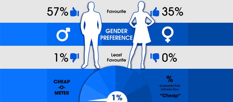
Blue has a calming effect on the mind and is considered the color of reason, strength, wisdom and trust, so it’s a common choice for healthcare, IT companies, and financial institutions, as these companies rely on your trust.
According to a YouGov survey, it’s the world’s favorite color.
However, the wrong shade of blue will make the audience feel sad and cold.
There aren’t any naturally blue foods in nature, which is why it can make audiences lose their appetite — one reason why there aren’t many food companies with blue in their branding.
Use blue to foster a sense of calmness and dependability.
But be careful because overuse of the blue color can make you blend in rather than stand out so it’s not without risks.
Brands That Use The Color Blue
Famous brands using blue include:
Ford
PayPal
American Express
Nivea
Samsung
Intel
Visa
Dell
Allianz
Nokia
Volkswagen
Explore Brand Strategy
Programs & Tools
Yellow
Yellow represents youthfulness, happiness, fun, and sunshine. Different cultures also perceive it as the color for prosperity and joy.
It can be powerful to use as a complement to darker colors.
Yellow Attributes & Personality
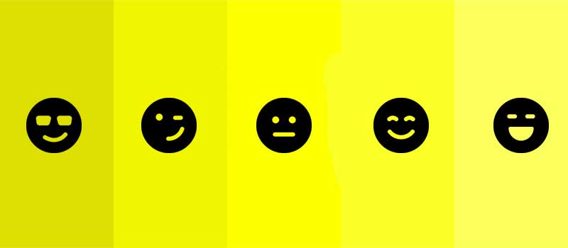
The positive attributes associated with yellow include:
Optimism
Warmth
Happiness
Creativity
Intellect
Extroversion
The negative attributes associated with yellow include:
Irrationality
Fear
Caution
Anxiety
Frustration
Cowardice
When To Use Yellow In Branding
Yellow is perhaps most associated now with the omnipresent emojis.
That iconic happy face reflects yellow’s connotations of optimism, happiness, and creativity.
Yellow is bright and reminds us of sunshine so it’s a great strategic color to align with that warm feeling.
Yellow tints can challenge the eyesight, while darker yellows can make people feel ill or sickly, and can even evoke feelings of depression and sadness. So it’s best to use this color carefully.
Brands That Use The Color Yellow
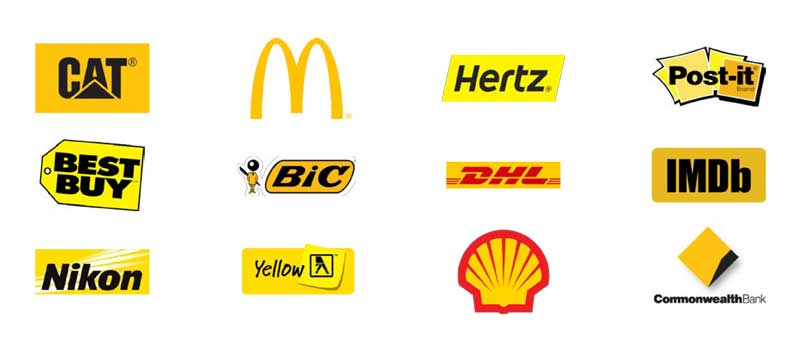
Famous brands using yellow include:
CAT
McDonald’s
Best Buy
Hertz
Post-It
BiC
DHL
IMDb
Nikon
Yellow Pages
Shell
Commonwealth Bank
Green
Immediately, the color green makes us think of eco-friendly branding and the concept of ‘going green’.
From an early age, we learn to associate green with nature — it is refreshing, healthy, and resembles growth.
Green Attributes & Personality

The positive attributes associated with green include:
Health
Hope
Freshness
Nature
Growth
Prosperity
The negative attributes associated with green include:
Boredom
Stagnation
Envy
Blandness
Debilitating
When To Use Green In Branding
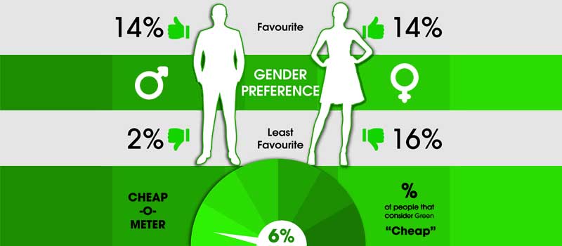
Green is a deliberate choice for the Starbucks logo, encapsulating its brand identity as an eco-conscious provider of refreshments.
Green can be relaxing and synonymous with health, which makes it an obvious choice for eco-conscious brands.
It also represents power — finances and the military are both industries where green dominates.
Like all colors, though, green has its negative side. Different shades and tints can elicit opposite connotations — green can transmit both health and sickness, luck and envy.
Brands That Use The Color Green
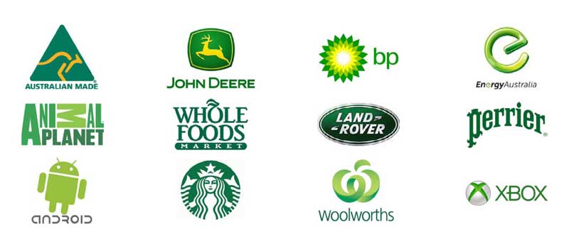
Famous brands using green include:
Australian Made
John Deere
British Petroleum
Energy Australia
Animal Planet
Whole Foods
Land Rover
Perrier
Android
Starbucks
Woolworths
Xbox
Orange
Orange, like yellow and red, is warm and vibrant.
It immediately attracts attention, hence its universal use for traffic cones.
Its brightness inspires innovation, excitement, and confidence, making it the perfect choice for Home Depot to encourage you along your DIY journey.
Orange Attributes & Personality

The positive attributes associated with orange include:
Courage
Confidence
Warmth
Innovation
Friendliness
Energy
The negative attributes associated with orange include:
Deprivation
Frustration
Immaturity
Ignorance
Sluggishness
When To Use Orange In Branding
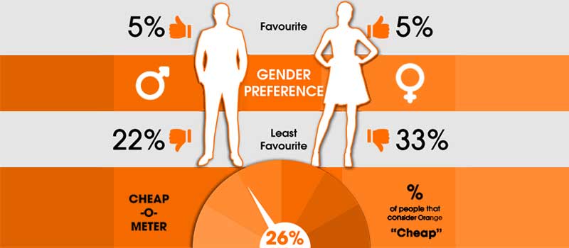
Orange garners feelings of warmth and energy as it’s associated with the sun and citrus fruits, including its namesake.
This makes it bright, light, and fun — perfect for youthful and non-corporate brands. At the same time, darker shades are associated with autumn and more earthy sensations.
Orange is often used with grounding colors to add balance — blues, black or brown are commonly seen with orange.
When using orange, context is critical. For example, orange’s negative connotations include frivolity and immaturity, yet both of these traits can be positive if you are a brand like Nickelodeon.
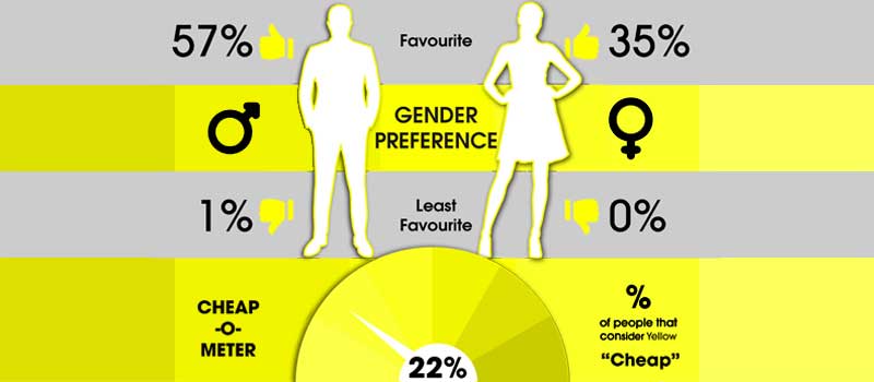
And it is the color most people consider cheap, so it’s not surprising that brands like Payless use it.
Brands That Use The Color Orange
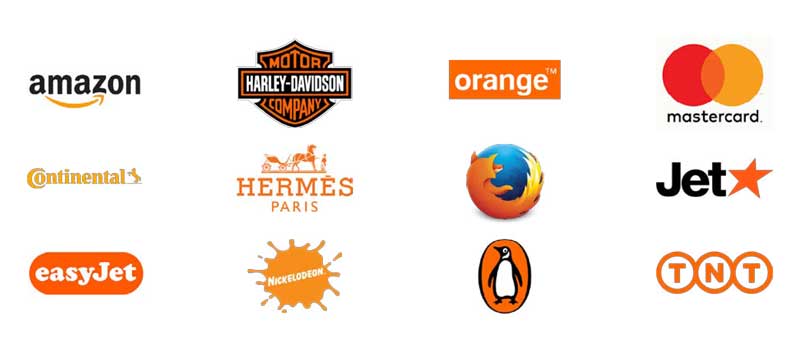
Famous brands using orange include:
Amazon
Harley-Davidson
Orange
MasterCard
Continental
Hermès
Firefox
Jet
EasyJet
Nickelodeon
Penguin Books
TNT
Black

The color black is elegant and sophisticated with connotations of wealth and class – think of the famous instance of the little black dress.
That’s why it’s used in so many luxury brands like Chanel, Prada, and Gucci, and even Apple’s simple black logo.
This coincides with black’s status as the color of menace.
Black Attributes & Personality
The positive attributes associated with black include:
Sophistication
Security
Power
Elegance
Authority
Substance
The negative attributes associated with black include:
Oppression
Coldness
Menace
Heaviness
Evil
Mourning
When To Use Black In Branding
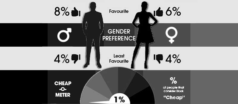
When used strategically, black is a powerful color associated with luxury and power.
Luxury brands often use it in combination with white for a minimalist look.
On occasion, using a bright color as an accent can add energy to sophistication.
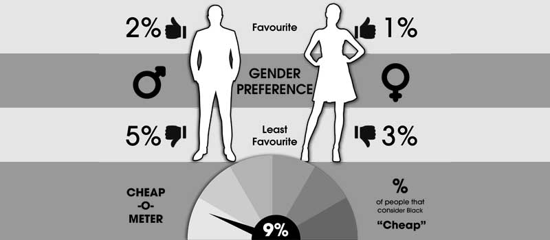
However, it’s crucial to be mindful of the context — using black for a sportswear brand would be significantly different than using it for a healthcare brand, which could cause discomfort as it’s associated with death and mourning.
Brands That Use The Color Black
Famous brands using black include:
Nike
Channel
World Wildlife Fund
Accenture
Hugo Boss
Channel
Jack Daniel’s
L’Oréal
MTV
Puma
Moët
Ralph Lauren
White

Where black is the absorption of all light, white is the reflection and highlights the absence of any color.
It is associated with purity, cleanliness, and innocence.
White Attributes & Personality
The positive attributes associated with white include:
Innocence
Purity
Cleanliness
Simplicity
Pristine
The negative attributes associated with white include:
Sterility
Emptiness
Plainness
Caution
Distance
When To Use White In Branding
The simplicity of white dovetails well with the class of black which is why it’s such a classic combination.
It represents cleanliness and has become a go-to for a modern look and feel.
However, when poorly executed, it can feel lazy and bland. White can also evoke emptiness and isolation.
Therefore, the notion of white space in branding is helpful but should be used sparingly — sleek and chic can become sterile and cold.
Brands That Use The Color White

Famous brands using white include:
Adidas
Burberry
Cartier
Apple
Lexus
Mini
Prada
Sony
Tesla
Zara
Kappa
Lancôme
Purple
Historically, the color purple has been considered luxurious.
This goes back to ancient times when fabric dyes were extremely expensive and hard to come by — which meant that only royalty and upper-class citizens could afford to wear purple outfits and decorate their homes with this color.
Purple Attributes & Personality

The positive attributes associated with purple include:
Wisdom
Wealth
Spirituality
Imagination
Sophistication
On the flip side, the negative attributes associated with purple include:
Reflection
Decadence
Suppression
Excess
Moodiness
When To Use Purple In Branding
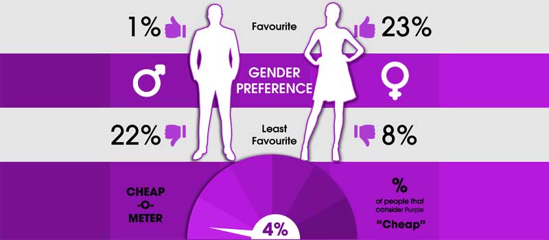
Purple lends itself well to brands that want to convey a feeling of class, sophistication, and prestige.
However, it can also stir feelings of excess and extravagance, so it’s best to be careful. Purple shades can be moody, but tints can provide a feminine touch.
Brands That Use The Color Purple

Famous brands using purple include:
Cadbury
Yahoo
Hallmark
FedEx
Benq
Milka
Starlight Children’s Foundation Australia
Syfy
Zoopla
Taco Bell
Sydney Kings
Magenta
Classically used for feminine brands, magenta can be impactful.
It’s a positive color that inspires comfort and represents hope.
Magenta has successfully been used in traditional industries as a way to stand out from the competition.
Magenta Attributes & Personality

The positive attributes associated with magenta include:
Imagination
Passion
Caring
Creativity
Innovation
Quirkiness
Its negative attributes include:
Outrageousness
Rebelliousness
Flippancy
Impulsiveness
When To Use Magenta In Branding
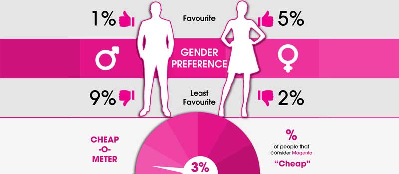
Magenta is the most widely used color to portray femininity.
It’s also an effective color to choose when the goal is to break the mold and stand out from competitors — such is the case of T-Mobile using it to differentiate itself from mobile carriers’ classic blues, yellows, and oranges.
Magenta works well as an accompanying color to inject a youthful vibe into formal brands but used in excess, it can feel eccentric and overwhelming.
Brands That Use The Color Magenta
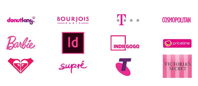
Famous brands using magenta include:
Donut King
Bourjois
T-Mobile
Cosmopolitan
Barbie
InDesign
Indiegogo
Priceline
Roxy
Supré
Victoria’s Secret
How to Use Color Psychology in Your Brand Strategy

As you review the various psychological associations of the colors above, you may be thinking, “Okay, so what is right for my brand? How can I use this?”
Clearly, color perception goes well beyond personal preferences. The way we perceive colors matters a great deal when making strategic brand decisions.
Your brand awareness and brand recognition are vital to get right – your brand’s visual identity strongly influences how the world perceives your company.
Obviously, there are many components to communicating your brand to your target audience, and choosing the best colors for your brand is one crucial step.
Color psychology is one factor to consider alongside aligning colors with your brand’s personality.
Let’s delve a little deeper into the process of choosing the right colors for your brand strategy.
#1. Understand The Audience

Step one is fairly predictable; the first step in any marketing decision-making is understanding your target audience.
The brand exists to serve the audience, and it’s in their mind the brand is built.
Therefore, defining and understanding your target audience cannot be overstated.
Your target audience begins wide and should be focused down to a narrow group – the narrower, the better for your marketing activities to zero in on a specific portion of the population.
You’ll develop an understanding of your target audience through creating buyer personas – fictional characters that represent a specific potential customer segment.
You need to know their likes/dislikes, hopes and dreams, and biggest fears – their market demographics and market psychographics.
This will help you make your ongoing strategic decisions and will be an important factor in determining your brand colors.
#2. Define The Brand’s Position

A strong brand positioning strategy is an absolute must for all businesses striving for success.
Brand positioning is all about setting your company apart from the rest and defining your unique value to the customer.
Positioning is about understanding how you compare to the competition and where will your business sits in the industry comparatively.
There are many methods to this – it’s helpful to use a positioning matrix to help define your brand’s position.
Again, establishing a competitive position will help inform your branding process – your logo design, your slogan, and, of course, your color scheme.
It’s important to choose colors that feel appropriate to your industry and authentic to your products or services. It’s important, however, not to forget that you’ll also want to select a great color palette that differentiates you from the competition.
#3. Craft The Brand’s Personality & Attributes

Going above and beyond simply defining your brand position, you need to firmly convey your brand’s personality and attributes in your brand strategy. And the use of color is one of the first steps to achieve that.
Personality is something we attribute to humans, which is why it’s so impactful in branding.
We connect with brands in the same way we connect with humans.
We look for attributes we like and we’re drawn to the brands that display what we’re after.
In fact, the word anthropomorphize means to attribute human characteristics or behavior to a god, animal, or object. We have a word for it because it’s what we do as humans.
Since color is such an immediately provocative attribute evoking emotions in the viewer, it is one of the easiest ways you can convey your brand personality to the audience.
Compare the clothing logos of Levi’s, Adidas, and Nike – what does their choice of color say about their brands’ personalities?
Levi’s logo is an iconic and vibrant red – that red tab is the hallmark of their brand and reflects the energy of their branding –
It conveys a distinctly American sense of fearlessness and power, backed up in other areas of their marketing.
Nike and Adidas both opt for black and white logos – reflecting their serious and professional approach to providing quality sportswear.
In their case, the color black demonstrates their authority.
While color is not the only element that conveys a brand’s personality, you can see from these examples that personality should inform your brand colors.
Colors that are jarring or conflicting with your brand personality will quickly turn off consumers.
#4. Match Your Brand’s Attributes To Relevant Brand Colors

Once you can clearly communicate your brand personality, brand position, and focused target audience, you can then think about choosing suitable brand colors.
Do youthfulness and cheerfulness characterise your brand? A yellow may be apt.
Are you a healthcare provider looking to instill a calming trust in your branding in the audience? Incorporating blue may be a good idea.
Are you a luxury fashion boutique looking to make a splash in the elegant and sophisticated but competitive world of high fashion? Then black would be a great base, but consider other colors to help differentiate your brand.
#5. Create A Color Palette To Express Your Brand

So far, we have talked chiefly of logos, but, in fact, color psychology in branding will go beyond the logo to other elements.
Depending on the business, this may include web design, in-store design, staff uniforms, and so on.
As such, you’ll usually need to use a collection of complementary colors – otherwise known as a color palette.
This means choosing colors that do not clash – that work well together and are pleasing to the eye.
Now, although there is an element of subjectivity here, there are general rules to follow for finding complementary colors.
This involves some knowledge of the color wheel.
The color wheel is a visual representation of hues arranged according to their wavelength.
Color wheels allow color harmonies to be represented geometrically and show the relationship between primary, secondary, and tertiary colors.
In essence, a color wheel can take the element of chance out of simply ‘eyeing’ color combinations and provides a foolproof way of selecting colors that go together.

Here are some ways to use the color wheel to find colors that don’t clash:
Complementary colors: These are direct opposites on the color wheel. An example of this would be the purple and yellow in the Planet Fitness color scheme.
Analogous colors: These are colors next to each other on the color wheel. A good instance of this in action is the green and yellow scheme of John Deere.
Monochromatic: Monochromatic color palettes make use of one hue and a range of its shades, tints, and tones. An example of this is Twitter’s use of blue across its content that hopes to evoke a sense of reliability.
Triadic colors: Three colors that are evenly spaced around the color wheel.
Split complementary colors: A base color plus the two colors that are adjacent to the base color’s complement on the color wheel.
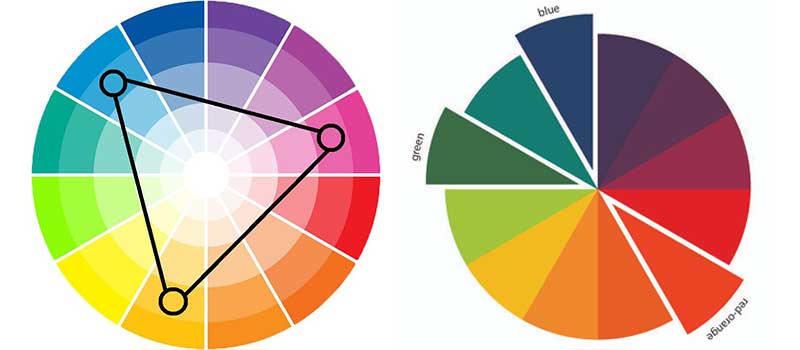
Within each main color, or hue, there is also the full range of tints, shades, and tones, as well as different levels of saturation:
Tint: What you get when you add white to a particular hue
Shade: What you get when you add black to a particular hue
Tone:What you get when you add varying grays to a particular hue
Saturation:Saturation defines a range of color starting with gray (0% saturation) and ending with a pure, gray-less form of the color (100% saturation).
What all this means is that there is a dizzying range of possible combinations of colors to create your perfect palette.
The paint company Behr stocks over 1,400 different colored paints, but that pales in comparison to the 1 million possible colors detectable to the human eye.
The upshot?
You need to spend time finding colors that represent your brand identity, that complement each other, and that evoke the kind of emotions you want to communicate to your target audience.
Do you want to go with a trustworthy blue?
Okay, what shade of blue specifically?
Ultramarine, royal, pastel, cobalt, Yale, baby?
Each shade has different connotations and has different complementary counterparts!
Ultramarine, royal, pastel, cobalt, Yale, baby?
Each shade has different connotations and has different complementary counterparts!
#6. Apply Your Brand Colors Consistently

Once you have thoughtfully selected your brand’s color palette, you will need to utilize it appropriately.
Building brand consistency is crucial to establishing a relationship with your ideal customer.
Brand recognition takes time, so you need to inject your brand’s personality into all consumer touchpoints over a sustained period.
Why? Well, ultimately, brand consistency considerably increases revenue over time.
Obviously, building that brand consistency is a multi-faceted task, but managing and utilizing your color palette effectively is one way to build brand recognition and communicate with your target audience in a meaningful way.
Let’s take IKEA’s iconic logo.
The blue and yellow combination was adopted in 1967, and was only changed for a brief two years from 1981-83. That is a considerable length of time to allow brand recognition to build.
The logo’s colors are great for a furniture store as the blue represents durable dependability while the yellow evokes an optimistic, bright vibe.

Furthermore, the colors link to the brand’s Swedish identity, wrapping up the visual identity in a neat little bow.
Whenever you go to an IKEA store, you see the blue and yellow color palette reinforced, with tote bags, uniforms, and even the store buildings kitted out in the killer two-color combination.
Here is a brand in which the two primary colors are clearly a focal point of its visual identity.
And of course, in the digital age, you should incorporate your color palette across websites and social media, too.
This will require skill and craftsmanship to apply the colors effectively without harming the user experience.
To take the IKEA example, their website features mainly black and white tints and shades so as not to detract from the iconic yellow and blue logo.
This also conveys a sleek, elegant simplicity – a running theme in the design of their famous Scandinavian furniture.
This is a perfect example of marrying the brand’s personality to a color palette.
Over To You
Building brand recognition and an effective brand identity to communicate your brand strategically is integral to any successful business.
Choosing a brand color palette is a critical element of branding because it communicates your brand identity, personality, and attributes to your target audience.
There are several things to consider when choosing colors and familiarizing yourself with how a color wheel works will go a long way to a successful outcome.
You’ll also need to reflect on the psychology of colors so take time to inspect and understand the connotations of your color choices.
Why?
Because we know that different tints, shades, and tones have varying effects on the consumer.
It’s critical you find the right combination to convince the audience to emotionally invest in your business since emotion often drives purchasing decisions.
Remember, as humans, we connect through attributes and emotions and there are few tools as powerful as color to do just that.
On-Demand Digital Program
Brand Master Secrets
Make the transition from hired-gun to highly valued brand strategist in less than 30 days. The systems, frameworks and tools inside this comprehensive program are all you need to level up.


