Brands live and die in the minds of consumers.
They’re put there through a consistent brand application that shapes perceptions.
These perceptions don’t happen overnight.
They happen over time by consistently applying clearly defined brand guidelines within a broader marketing strategy.
In this article, we’ll explore some fantastic brand guidelines examples showing how the world’s most recognizable brands control their own brand and brand identity.
But, first things first, let’s differentiate between brand guidelines and a brand style guide.
Brand Guidelines vs Brand Style Guide

It’s important to note that although terms such as brand guidelines, brand style guide, and brand expression guide are often used interchangeably, there are differences.
What is a Brand Style Guide?

A brand style guide is a rule book for the brand’s visual identity. It determines the look and feel of the company.
The style guide is created by the originating designer and includes visual application rules around:
Typography
Illustrations
Imagery
Typesetting
Graphics
Packaging
Environmental
Digital
Often they come hand-in-hand with a library of visual brand assets to be used by designers and other marketers with the responsibility of expressing the brand visually.
What are Brand Guidelines?

While the brand style guide focuses specifically on the visual brand identity and the rules around its consistent expression, the brand guidelines, or a brand book, sets broader rules of brand application.
Inside most brand guidelines, you’ll find the brand style guide and the rules around the visual identity though, you’ll also find more strategic elements at play.
The brand guidelines act as a bible for how the brand is communicated across all platforms, channels and touchpoints, visually, verbally, audibly and beyond.
A comprehensive brand guideline can include
Brand purpose
Brand vision
Brand mission
Positioning statement
Value proposition
Brand personality & attributes
Verbal Identity
The tone of Voice & Language
Brand Messaging & Communications
Brand Style Guide
In other words, brand guidelines such as these provide a comprehensive guide for how the brand should be expressed no matter where or how the brand is engaging the audience.
This guide ensures brand consistency.
Brand guidelines guide employees, designers, social media managers, copywriters, content managers, marketing managers, brand managers, executives and everywhere in between.
PRO Brand Strategy BluePrint
Build Brands Like A Pro Brand Strategist

What Should the Brand Guidelines Include?

Brand guidelines act as a blueprint for a brand designed to shape how the audience should perceive the brand.
I’ve already mentioned the elements of what the brand guidelines covers, and the style guide within the overarching brand guidelines.
We’re talking about detailed explanations of the brand’s heart, verbal identity, visual identity, and other brand elements.
Precise explanations on how to use color schemes, where to feature the company logo in an infographic, the typeface for the tagline, the tone of voice on social media, etc.
What’s important to realize is that the whole document builds the perception of the brand in the mind of all stakeholders.
It’s a foundational document that brings the brand to life in the mind of employees.
In turn, the employees are responsible for representing the brand, so it takes a specific shape in the audience’s mind.
Explore Brand Strategy
Programs & Tools
Why Do You Need Brand Guidelines?

Successful brands are consistent.
They present the same version of themselves to customers every day to build brand recognition.
The best brands do this through advertising campaigns, social media channels, physical store locations, and other instances in which they interact with consumers.
A clear set of brand guidelines is vital to presenting that consistent message to consumers over time.
Brands communicate with the audience across potentially hundreds of touchpoints.
These touchpoints mean multiple brand teams encompassing all employees must be on the same page when representing the brand.
Your brand guidelines act as a guiding rulebook they can follow to ensure the desired presentation of the brand.
The brand guidelines minimize the risk of mixed messages undermining the brand in the audience’s mind.
7 Examples of Stellar Brand Guidelines

To help us visualize what this looks like in practice, let’s take inspiration from some brands with comprehensive brand guidelines.
What makes these great is that they signpost elements of the broader brand strategy into the brand guidelines.
#1. Spotify

Spotify names its comprehensive brand rule book “Design Guidelines”.
In it, Spotify outlines many of the brand guidelines basics as you’d expect, including:
Using the logo
Using colors correctly
Font use for different headings and text
Naming restrictions
However, the instructions for developers to integrate the Spotify app into various platforms are extra interesting within Spotify’s guidelines.

Here is where the guidelines give an insight into the broader brand strategy:
These guidelines have been developed to ensure that all Spotify users receive the same delightful user experience – no matter which platform they listen on.
This quote is interesting for two reasons.
Note the importance of consistency. Spotify’s brand managers want to ensure users experience the same recognizable app wherever they encounter it.
Second, Spotify places significant importance on offering a personalized user experience that is “innovative” and “playful”, according to its core values.
The brand guidelines for developers make it clear that this “delightful” user experience is paramount.
#2. Slack

Slack’s brand identity guidelines come in the form of a simple downloadable PDF.
In them, you find the expected instructions to help people use the brand assets correctly and maintain consistency.
These instructions would have been especially helpful during the 2020 rebrand that saw Slack revamp its logo.
The detailed notes that outline the brand’s tone of voice are especially interesting.
Slack frames itself as a helpful, informative, yet playful colleague in the workplace.
As such, the brand strategists need to humanise the brand.

The brand guidelines set out instructions for the tone of voice that help support this brand personality.
The approach is summarized with the quote: “We are humans speaking to humans.”
The guidelines go on to emphasize a few do’s and don’ts in the form of guiding principles:
We are confident (never cocky), witty (but never silly), conversational (but always appropriate and respectful), etc.
Here is an example of how the tone of voice plays a key part in the audience’s perception of the brand.
This importance is reflected in the considerable column space given to tone of voice in Slack’s brand guidelines.
#3. Starbucks

Starbucks’ style guide is called its “brand expression guide”.
And, in terms of rules, Starbucks’ snazzy dedicated website for its style guide within its broader brand guidelines is comprehensive, to say the least.
They must be since maintaining a cohesive identity as a world-conquering coffee chain behemoth is challenging.
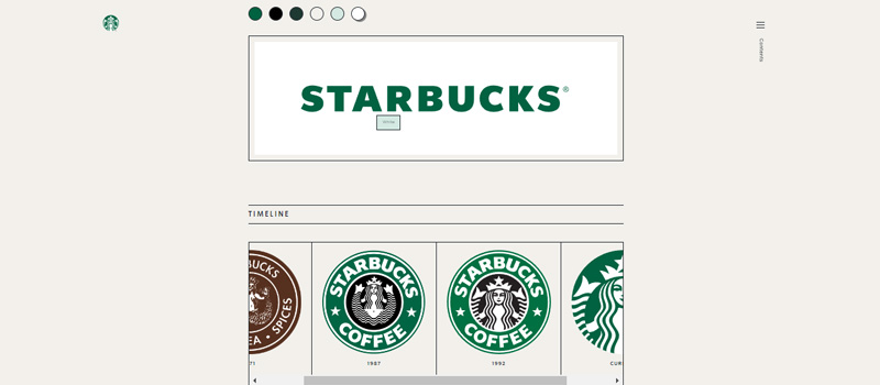
An interesting element to pick out is the logo evolution.
The preferred approach is to use the Siren logo by itself, unlocked from the wordmark.
A timeline shows how the logo has changed to its current form of the iconic siren without the wordmark.
This represents the broader brand strategy to make the wordmark-less logo synonymous with the company name. At this point, the brand recognition is strong enough that the wordmark is no longer needed.
The siren is now akin to the golden arches.
#4. Mailchimp

Mailchimp understands that tone of voice is an essential element of its brand identity.
That’s why brand strategists created a standalone content style guide to govern all its content creation.
Just to be clear, this is a whole separate comprehensive document to its design style guide that covers the logo, typography, and other visual elements.
I’m picking this out because it again reflects what the marketers at Mailchimp believe is integral to its appeal.
The content style guide includes guiding principles of writing to “empower, respect, and educate” and more specific instructions on number use and writing in the active voice.

The tips are backed up with plenty of examples and case studies showcasing the content guidelines.
Why does Mailchimp feel the need to do this?
They understand that their brand voice holds appeal to the consumer. So, they want to protect this as an asset and ensure it comes across consistently.
With this content style guide, all writers creating various content pieces for Mailchimp can easily stay on-brand.
Both their content and design guidelines are visually minimalist and succinct, communicating the brand’s design philosophy through the guidelines themselves.
#5. Zendesk

The Zendesk brand guidelines were created to ensure that all of their content—writing, videos, graphic design, and so on—delivers a unified message.
The style guide features less common sections on presentation design, copywriting, film, and experience, even detailing how Zendesk office spaces should look.
Each section has subsections that comprehensively explain the ‘why’ of all decisions.
They share simple do’s and don’ts, tips, and resources to make the brand guidelines easy to apply.
Zendesk’s brand strategists work on the principle that clearly communicating the ‘why’ of the brand in its brand guidelines creates the foundation for a strong brand story.
#6. Youtube

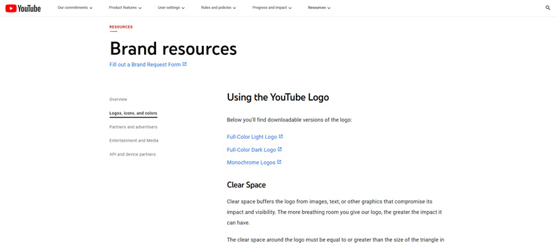
Youtube’s brand resources section sits within its website on a streamlined, concise webpage.
Brands like Youtube partner with hundreds of other organizations and businesses. Just think of all the different places you can come across Youtube’s red play icon.
Therefore, brands like Youtube often publish very specific instructions about how to use their logo so that other partners can maintain and support the brand’s identity.
More often than not, this section is more about what not to do with the logo.
Youtube tells its external partners:
Don’t stretch the icon shape vertically or horizontally
Don’t change the triangles’ angles or size
Don’t use colors other than red, almost black, and white
Don’t rotate the icon
Don’t add special effects
And the list goes on.
It does this because it wants to protect that icon as a brand asset.
Manipulating the icon in any way would immediately be a red flag to a user. Imagine seeing the Youtube icon with a slightly different shade of red. You would notice and be skeptical as to whether it was real.
So, protecting the icon in this way helps avoid reputational damage from misuse and builds recognition of the Youtube product over time.
#7. Audi

Audi’s brand guidelines are a classic example of how the document itself can serve as an advert for the brand.
Everything about the well-designed interactive microsite is luxurious and sophisticated, with a sleek mix of white space and monochrome text.
The feel of the brand guidelines evokes the feeling we have for the cars.
The instructions are comprehensive.
The typical style guide features and brand mission are covered under the heading “Basics”.
However, beyond that are several headings related to other branding activities.

For example, there are clear directions for “Motion Branding” that inform the “progressive” and “unique” approach to moving images in Audi content. Specifically, there are precise instructions on how the “rings” of the Audi logo need to feature.
Elsewhere, there are also instructions for how to evoke the “corporate sound”, with the “Audi Heartbeat” part of the acoustic identity of the brand.
The Audi brand guidelines are a terrific example of how brand managers construct every single element of the brand so that, in Audi’s words, the consumer will
journey directly into the brand world and experience it through your senses.
If we think of building a brand as world-building, then it makes sense that you’d want to have a set of guidelines to protect your “world”.
Tips on How to Create Brand Guidelines

What can we learn from these brand guidelines and style guide examples?
We should see that brand guidelines are a written representation of brand strategy.
It defines the features that set out the brand position, clearly expressing what is unique about the brand.
The document is like a brand bible, including anything anybody might want to know about what the brand stands for and what it should look and feel like.
So, therefore, the first tip is to be comprehensive.
#1. Be Comprehensive

Write guidelines sharing information about the brand heart, visual identity, and verbal identity.
Brand heart refers to the mission statement, brand values, brand purpose and brand vision.
Visual identity refers to how the brand looks.
Verbal identity refers to how the brand personality comes through in content and messaging.
Being as specific as possible leaves less room for uncertainty and more clarity for those implementing the brand day-to-day.
The more comprehensive the guidelines on these elements, the clearer picture you can create of the brand identity and broader strategy.
#2. Brand The Brand Guidelines

Use the brand guidelines document, whatever form it takes, as a case study in itself for the brand guidelines.
This goes beyond sharing examples and do’s and don’t lists showcasing how the brand should look and feel.
Instead, incorporate all the brand guidelines related to brand heart, verbal identity, and visual identity into the very document itself.
This approach creates the brand guideline document as a shining example of the brand guidelines, reinforcing its purpose.
#3. Make The Guidelines Accessible

An instruction manual only works if users can access it.
Even then, it’s only useful if those accessing it know how to use it.
Therefore, brand managers should make the brand guidelines document available to those who may need to access it.
Store it in a shareable location that is visible to everybody. For example, this could be a prominent place in the work intranet.
Also, try to make it as user-friendly as possible.
Sure, graphic design experts and copywriters may understand the underlying branding principles, but not everybody reading the document may be familiar with the intricacies of brand strategy or industry jargon.
Write in plain-spoken language that expresses complex ideas in a straightforward, easily digestible way.
#4. Include Helpful Features

Part of making the guidelines accessible is sharing information in a way that makes sense to the reader.
So, utilize some of these helpful features to illustrate the key points of the brand guidelines:
checklists
do’s and don’ts
examples
tools and resources
templates
Getting the right balance between being specific with details and exhausting the reader can be challenging.
Sharing an app to double-check hex codes may be useful for graphic designers.
A quick set of do’s and don’ts can help store managers properly arrange their shop floor.
Examples of ideal content can inform copywriters on how to write in the desired brand voice.
#5. Update If Necessary

Refer back to the brand guidelines as the brand evolves.
Perhaps some elements need to be updated.
Perhaps a section needs to be made clearer because you observe that certain aspects aren’t being followed correctly.
Get feedback from the wider teams to find out how they use the brand guidelines and if they feel a section needs to be improved.
A brand is always growing and changing. This evolution may be due to internal shifts or because of external influences.
No matter the reason, brand guidelines should reflect those shifts in brand perception and brand strategy.
Over To You
Consistency is critical for a brand to brand to build recognition.
And, don’t underestimate the audience’s ability to notice every detail of a brand.
Every aspect of visual and verbal identity is important in building the look and feel of the brand that the consumer experiences.
So, setting down a list of rules for brand identity with some brand guidelines is vital to ensure you present a unified, consistent brand to the consumer.
As a brand manager, you want to ensure everybody is on the same page with clarity on the brand guidelines that reflect the broader brand strategy.
If you present a consistent, reliable consumer experience, the consumer begins to trust the brand, meaning they’re more likely to engage and return as a customer.
Ultimately, that leads to more sales and a better result for the business’s bottom line.
On-Demand Digital Program
Brand Master Secrets
Make the transition from hired-gun to highly valued brand strategist in less than 30 days. The systems, frameworks and tools inside this comprehensive program are all you need to level up.


Thanks so much for your outstanding content, Stephan!
most welcome